
Here at Vehiso, we build car dealer software for dealers of every size, and the website is usually the first thing a buyer sees. If you sell electric cars, that first impression matters even more, because EV buyers tend to research harder and compare more before they ever pick up the phone.
Today we are adding six new website templates: Shanghai, Osaka, Berlin, Reykjavik, Stockholm and Dubai. That takes our range from twelve templates to eighteen.
Six designs, not six colourways
This is the part worth stressing. Plenty of "new theme" launches are the same layout with a different accent colour and a new name. These are not that.
Each of the six is built around a different structure. The navigation sits somewhere different. The vehicle listings are arranged differently. The search behaves differently. Choosing between Osaka and Berlin is choosing a different kind of website, not a different paint job.
Three of them are dark. Three are light. Between them they cover everything from a quiet, photography-led showroom to a bold, type-driven statement.
What all six have in common
Whichever one you pick, the fundamentals are the same:
- Your colour, everywhere it counts. Every template takes your own brand colour and applies it to the things that matter: buttons, links, prices, the highlighted page in the menu. Two dealers on the same template with different brand colours end up with sites that feel like theirs, not like each other's.
- Your words and your photography. The headline, the supporting text, the button, the banner images, the reasons-to-buy-from-us panel. All of it is yours and all of it is editable. Nothing is baked in.
- Every car, properly presented. All six show the same real detail on every vehicle: photographs, make and model, trim, mileage, fuel type, gearbox, the price, any reduction from the original price, and the monthly finance figure where you offer finance.
- Built for phones as much as desktops. Each design reorganises itself on a smaller screen rather than just shrinking. The menus, the search and the listings are all designed for thumbs.
- A distinct typeface each. Part of what separates the six is the lettering, and each has its own, chosen to suit its character. If you would rather use a different one, you still can.
Everything is controlled through your dealer management system, so there is no code to touch and no developer to book.
The six designs
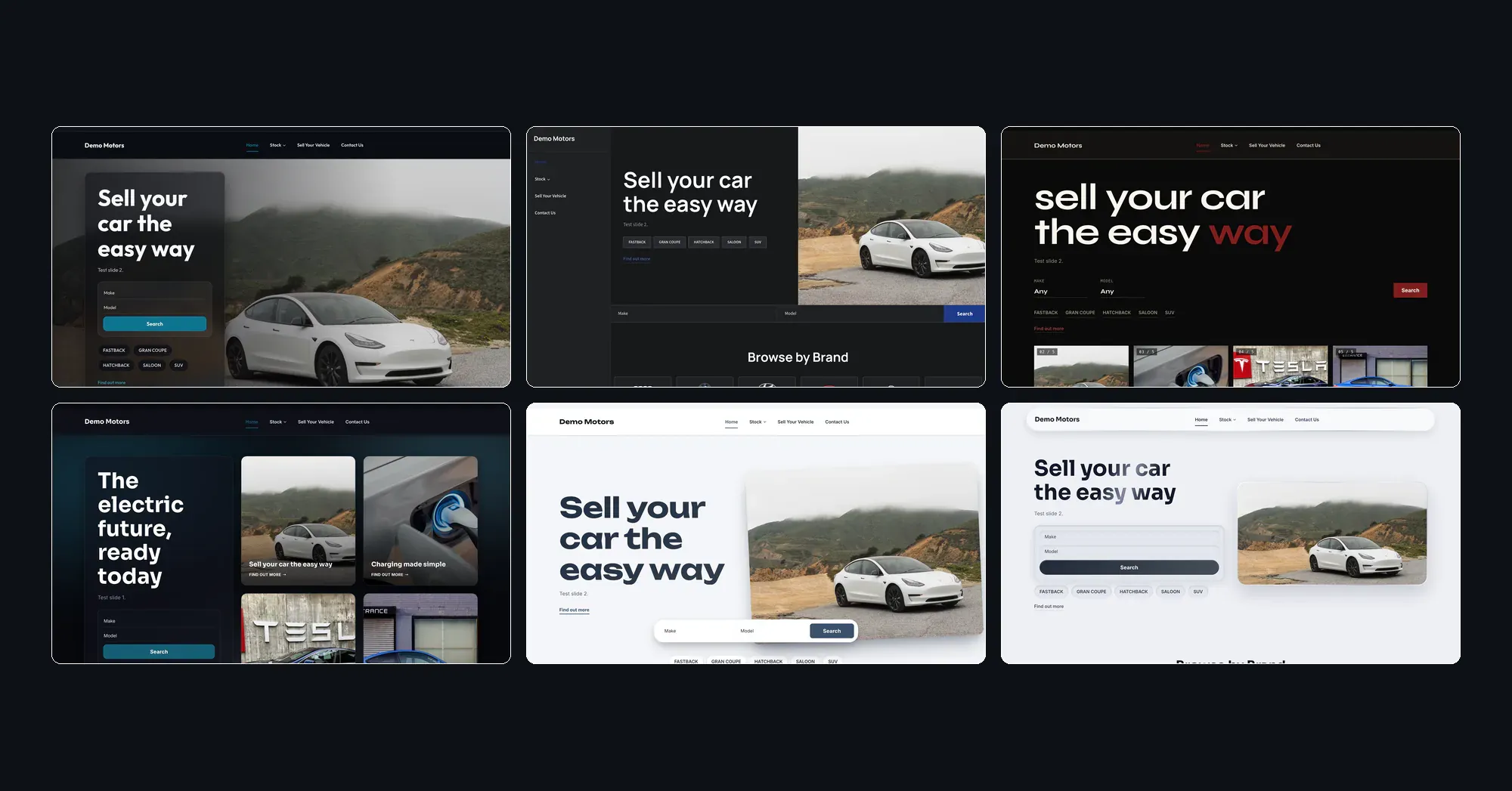
Shanghai: cinematic
Dark. Photography-led.
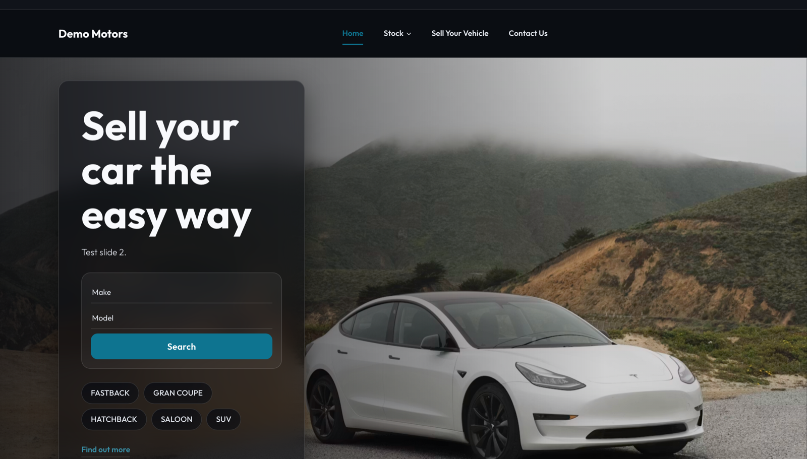
The most visually dramatic of the six. A single large photograph fills the top of the page, edge to edge, and the words sit on a softly frosted panel over the top of it, like glass laid on the image. The reasons to choose you float over their own photograph further down. Cars are presented in a row you swipe through rather than a grid.
Suits: dealers with genuinely good photography who want the cars, not the furniture around them, to do the selling. It works especially well for a smaller, more considered range of stock.
In a phrase: the showroom at night.
Osaka: the app
Dark. Precise and technical.
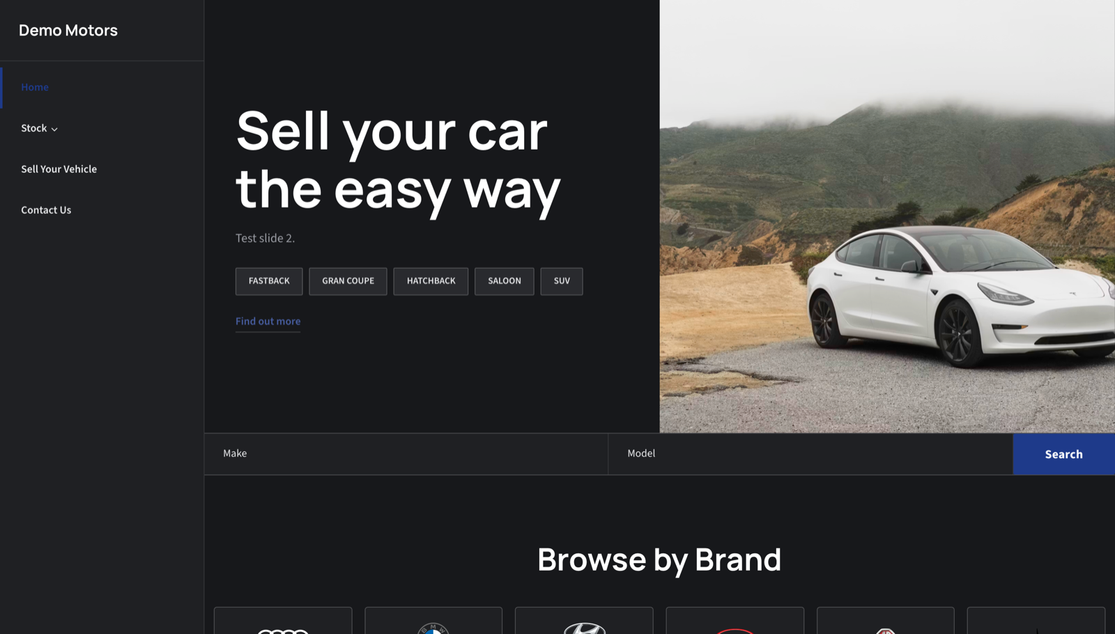
The navigation runs down the left-hand side of the screen and stays there as you scroll, rather than sitting in a bar across the top. It makes the whole site read like a piece of software rather than a brochure, with everything one click away and always visible. The listings sit in a clean, tightly ruled grid with no gaps or decoration.
Suits: dealers with a larger range that people will genuinely browse through, and anyone whose customers expect a modern, tech-forward feel. The sort of dealer whose buyers research carefully.
In a phrase: built like an app, not a brochure.
Berlin: the poster
Dark. Bold and stripped back.
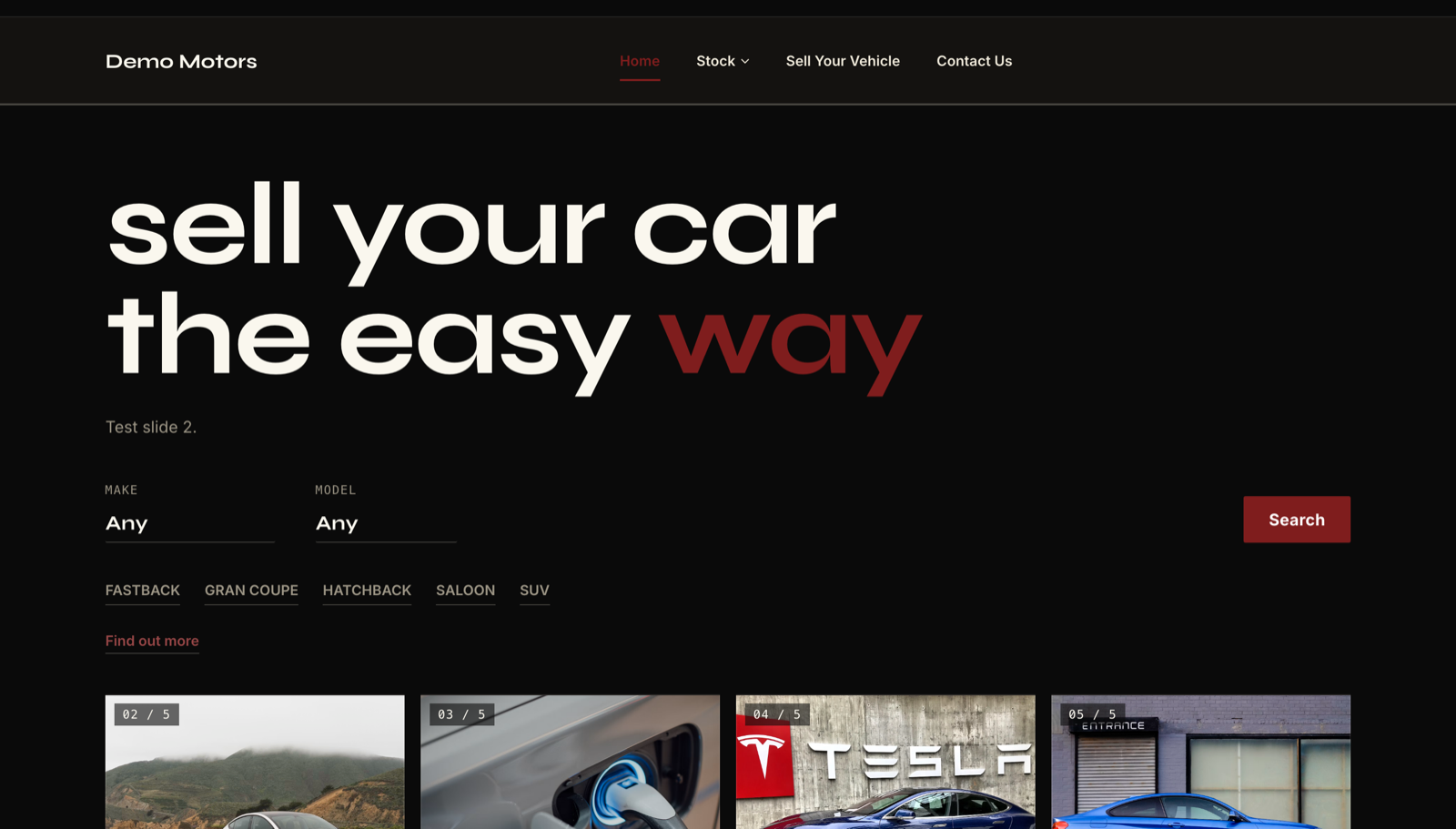
The most confident of the six. The top of the page is almost entirely typography: a very large headline in lowercase, with one phrase picked out in your colour. Photographs run beneath it as a strip of frames you move through. The search is a single underlined line rather than a boxed-in form. The listings have no borders, no boxes and no shadows, just the photograph, the words, and a fine rule above the price.
Suits: design-led dealers, specialists, and anyone with a small, carefully chosen range and a clear voice. It rewards good writing.
In a phrase: says less, louder.
Reykjavik: the aurora
Dark. Contemporary and premium.
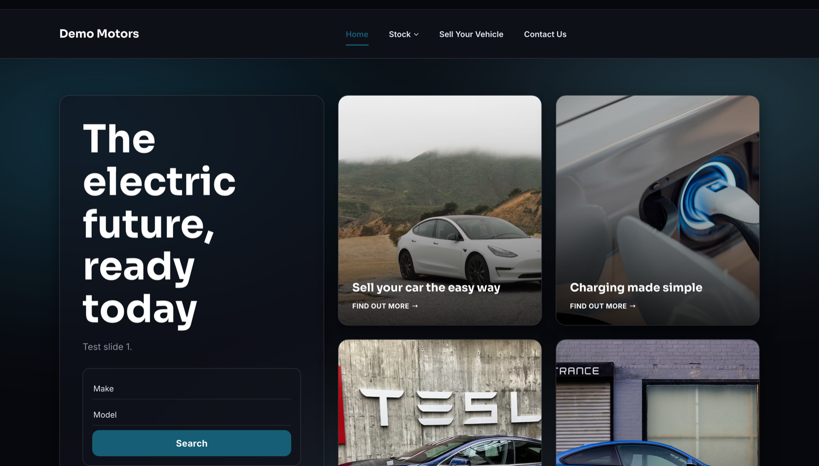
The top of the page is arranged as a set of tiles of different sizes, with one large panel holding the headline and the vehicle search, and your other messages sitting alongside it as smaller image and text tiles. Behind all of it, a soft wash of colour drifts across the background like the northern lights, and that colour is drawn from your own brand colour, so no two dealers' sites look the same.
Suits: a good general-purpose choice. Modern and premium without being stark or intimidating, so it works for a broad range of dealers.
In a phrase: contemporary, with a glow.
Stockholm: the poster, in daylight
Light. Bright, modern, Scandinavian.
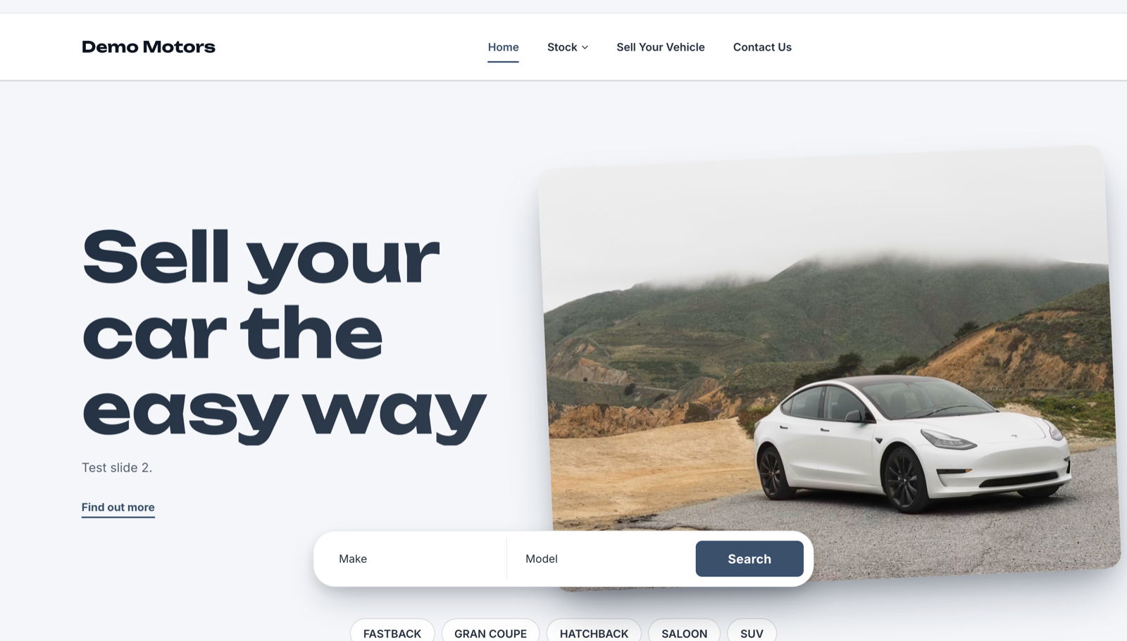
Big, confident lettering on a bright, cool grey-blue background, deliberately cooler and more contemporary than our existing light templates, which lean warm and traditional. The main photograph sits at a slight angle and runs off the edge of the page, which stops it feeling boxed in. The vehicle search sits in a rounded bar that floats over the bottom of the image rather than sitting neatly inside it.
Suits: dealers who want to feel current and approachable at the same time. Particularly good for a consumer-facing operation with a proper online buying journey.
In a phrase: bright, open and unmistakably modern.
Dubai: polished metal
Light. Premium and precise.
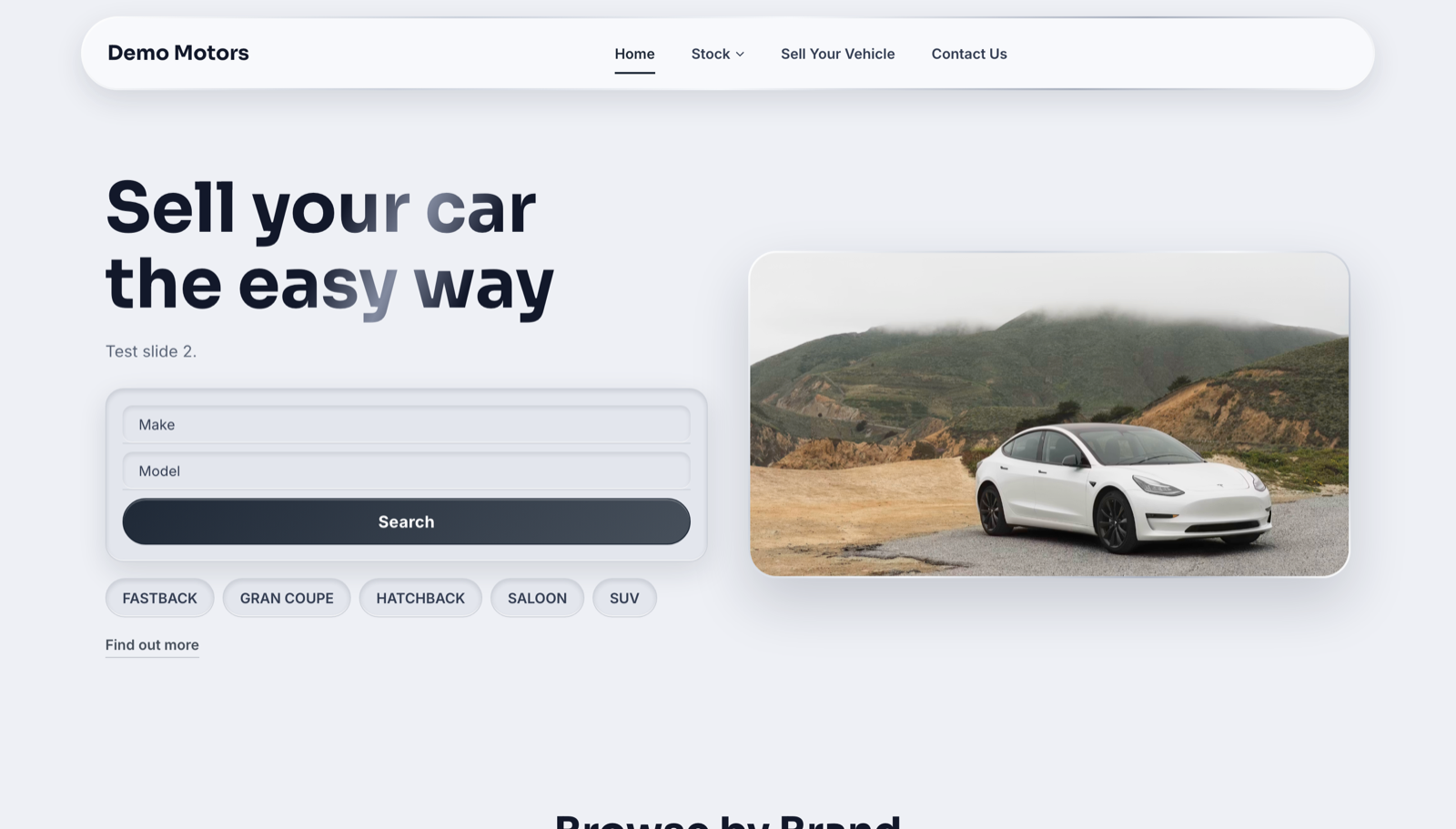
Everything on the page sits inside a fine metallic edge. The main photograph is framed like the screen of an expensive device, the cards have a brushed silver rim, the menu floats as a polished capsule, and the search boxes are gently recessed as though pressed into the surface. The whole page is silver and near-white, which leaves your brand colour as the only strong colour on screen. That is what makes it feel like yours.
Suits: luxury and prestige dealers, and anyone selling at the higher end where the presentation needs to feel expensive.
In a phrase: engineered, not decorated.
Choosing between them at a glance
| Template | Light or dark | Best for | Live demo |
|---|---|---|---|
| Shanghai | Dark | Strong photography, curated stock | View |
| Osaka | Dark | Larger ranges, tech-minded buyers | View |
| Berlin | Dark | Design-led specialists with a clear voice | View |
| Reykjavik | Dark | A modern, premium all-rounder | View |
| Stockholm | Light | Bright, current, consumer-facing | View |
| Dubai | Light | Luxury and prestige | View |
If you are torn between two of them, the honest advice is to pick based on your photography. Shanghai and Stockholm lean hard on images and look thin without good ones. Berlin leans on your words instead. Osaka and Reykjavik are the safest bets if your stock changes quickly. Our guide to car dealer website design goes deeper on the trade-offs, and if your photography needs work first, we have a guide on taking great photos of cars too.
Built for EV dealers, not limited to them
We designed these six with electric vehicle dealers in mind. The dark templates in particular suit the way EV stock tends to be photographed, and the layouts give room to the sort of detail EV buyers look for before they enquire.
That said, nothing in them is specific to electric cars. If you sell petrol, diesel, hybrids, vans or motorbikes, every one of the six will work exactly as well. Take Dubai if you sell prestige. Take Osaka if you carry a hundred cars. The EV framing is where they came from, not a restriction on who can use them.
Switching is not starting again
If you are already with us, changing template does not mean rebuilding your website. Your stock, your content, your pages and your settings all carry straight across. You change the template, and the same site is presented differently.
That makes it worth actually trying a couple. Switch to Berlin, look at it on your phone, switch to Reykjavik, compare. Nothing is lost either way.
How to get them
Existing Vehiso customers can switch from Website Settings in the dashboard. Pick the template, save, and your site updates.
If you are new to Vehiso, you can start for free and build your site with our car dealer website builder. The dealer management system is included on every plan, even the free one, so you can get a real site live with your own stock on it before you spend anything.
You can preview the full range of eighteen templates at demo.vehiso.com, and if you want to go further on making one your own, our guide to customising your car dealer website covers what you can change and where.